Chapter 2: Analyzing and Discussing African Art
Chapter 2.1 Elements of Design
Learning Objectives
- Identify key elements of design in two- and three-dimensional works
- Identify whether a traditional artwork conforms or departs from standard African approaches to art
- Analyze the stylistic traits of single and comparative artworks using art historical vocabulary
- Analyze the contextural traits of single and comparative artworks using art historical vocabulary
- Record key information about the context of an artwork in lectures and readings
- Memorize the ethnic group/artist, name, country, and century that identify an artwork.
- Create a study plan and an effective test strategy
- Identify key sources and plan research
The study of art history, whether that of Africa or any other part of the world, requires a specific way of looking at objects and describing them through the use of a discipline-based vocabulary. Stylistic analysis recognizes key visual aspects of two- and three-dimensional objects, characterizing them by discussing the elements and principals of design. The elements of design vary, depending on whether an object is flat (two dimensional; i.e., can be measured only via length and width) or not (three dimensional; i.e., its length, width, and depth can be mentioned. Although there is overlap, we will examine them separately.
Two-dimensional Objects
Drawings, paintings, prints, photographs, flat textiles, flat basketry (like mats), and collages are all two dimensional. We can consider them in terms of their line, shape, tone, texture, depth and (if the work is not black and white), color. In traditional African art, two-dimensional work mostly consists of flat textiles and some flat beaded panels, as well as Ethiopian paintings and Islamic illuminated manuscripts. Contemporary African art includes drawings, prints, photographs, and collages throughout the continent. Though style, theme, and impulse may vary considerably, the elements of design do not.
Line
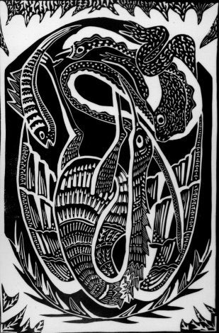
Two-dimensional artworks may include actual, contour, directional, and implied lines. Actual lines are created by the artist’s hand movements, and are the marks made by moving a tool from one point to another. They may be curved or straight. The latter can be horizontal (parallel to the top and bottom of the surface), vertical (parallel to the sides of the surface), or diagonal. Lines have varying width and can be light or dark depending on the pressure on the tool. Lines, like all of the elements of designs, have their own character and personality. A light, looping line may have a carefree or sensual feel, while verticals and horizontals create a sense of stability. If an artist wants to insert a feeling of motion or power, diagonals indicate action. While lines can simply indicate a mark, they can also describe an object–an outline. Placing them close together and crossing them may produce the effect of shade, or they may be rhythmically spaced to create a pattern.
Contours indicate an object’s edges, but they do not have to be actual lines where one object’s edge is perceived against a background or against another object, that non-drawn edge is considered a line, and can have a personality like a drawn line. Likewise, a limb or other section of an object has contours, but the whole of the limb can also be considered a non-drawn line describing a direction. Lastly, there are invisible lines that are psychological in nature; when two figures in an artwork look at each other, or a figure looks at a thing, there is an invisible sightline between the two.
Look at Fig. 94 and consider what kinds of lines dominate; they are illustrated by the red overlay in Fig. 95.
Shapes
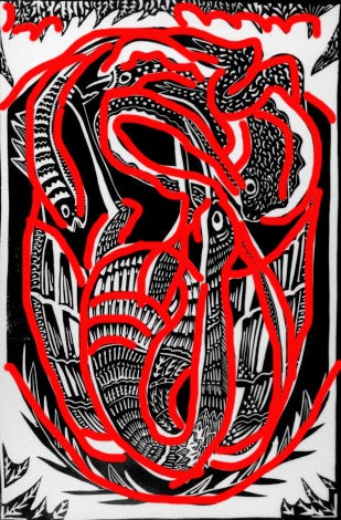
Shapes can be descriptive, identifying something in the real world–a person, house, rock. When the objects are natural, such as human beings, animals or plants, the shapes are often described as organic. Shapes can also be geometric, describing squares, circles, ovals, rectangles, etc. These do not necessarily have to be mathematically precise. Sometimes shapes do not result from the artist producing a shape, but from thebackground spaces around, within, or between created shapes; they are then the result of negative space.
Tone
Tone has to do with lightness and darkness; in a black and white work, tone refers to the distribution of black, white, and a range of greys. In a painted work, tones have to do with the relative lightness or darkness of a color section–if they were copied on a black and white photocopier, would two colored section be the same grey or would they be clearly differentiated by tone?
Tone can affect our perceptions of depth. A flat circle suddenly looks like a sphere when tone is added–shadows makes things appear to recede, while highlights make them seem closer. When you watch the video below, notice how the artist makes the face look three-dimensional through his manipulation of tone.

Texture
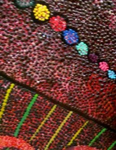
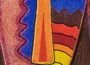
Texture relates to the way things actually feel (thick paint strokes, for example, that are raised from the background) (Figs. 96; 97), or to the illusion of known textures (a surface that is made of paint, but looks exactly like fur or metal because the artist understands how these materials reflect light and is able to mimic that). The video of one of Kelvin Okafor’s pencil drawings below demonstrate that–even without color–illusionistic textures can be produced by considering how different materials absorb and reflect light.
Depth
By definition, two-dimensional art cannot have actual depth. However, artists often try to create the illusion of depth through a variety of techniques. One of the simplest is overlapping. When we see one shape clearly, and it partially hides another shape, we perceive the complete shape as being in front of the blocked shape.
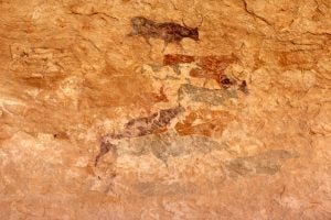
The position of two equally-sized shapes on a flat surface can also suggest a distance relationship–things at the bottom seem closer to the viewer than things at the top do. Fig. 98 includes a dark cow at the top that no other cows overlap. Nonetheless, because it is at the top of the composition, we read it as being farther away. This something operates with size–if two objects are the same size in the real world, and one is larger in a painting, our real-world cues can suggest the larger one is closer to us, depending on what other cues are present.

When an artist is painting a landscape vista, several factors can suggest a deep space: objects in the foreground are crisp, while those in the distance are less focused; objects in the foreground have more distinct colors, while those in the distance tend toward grey; objects in the foreground are dark, while those in the distance become paler. This combination of traits in landscape depictions of deep space is known as atmospheric perspective (Fig. 99). It mimics actual traits that can be observed in nature, when our perception of color shifts depending on distance, as does our perception of sharp focus and fuzziness.
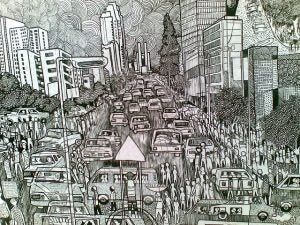
Scientific perspective is a systematic, mathematical effort to reproduce–on a flat surface–the way objects are perceived by our eyes in reality: standing in the middle of railroad tracks, the parallel rails appear to converge at the horizon, even though we know they don’t. Those who are accustomed to the realism of photographs and film find scientific perspective to be the most realistic way to show depth, because we are trained to read those flat images as representations of three dimensions. Artists trained in this system refer to one-point perspective, two-point perspective, and so on–each of these posits a shift in the viewer’s position. Some artists do not know the technical rules of scientific perspective, but are able to observe some of its characteristics, such as the apparent diminishing of structures as they recede towards the horizon. They may employ these observations to create an imperfect perspective effect that nonetheless indicates depth. Other trained artists are comfortable with scientific perspective, but bend its rules in places for a looser effect (Fig. 100).
Color
Not all two-dimensional work uses color, although tone is a constant element even in color work. In two-dimensional art, color is created via the application of pigments, or coloring agents. These may be combined with a binder that makes them usable (rather than dry powder) before they are (usually) and allows them to bond with a surface. The pigment and binder may need a diluent that allows them to be more liquid during application. The binder and diluent together are sometimes referred to as the vehicle. In oil paint, the pigment is combined with the binder of oil and the diluent is usually turpentine. Acrylic paint combines the binder with acrylic and uses water as the most common diluent; when dry, the liquid acrylic turns to plastic. Watercolor uses gum arabic as the binder for pigment, and water is its diluent.
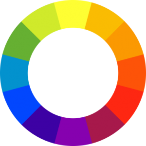
There are three primary colors or hues of pigment that, mixed with each other or with the addition of black or white, produce all other colors. These are red, yellow, and blue. Secondary colors result from mixing any two of these (yellow plus blue=green; yellow plus red=orange; red plus blue=violet). There are six tertiary colors resulting from a combination of primary and secondary colors (yellow-green, yellow-orange, blue-green, blue-violet, red-orange, red-violet). Primary, secondary, and tertiary colors can be arranged on a color wheel (Fig. 101) that cycles from yellow to orange to red to violet to blue to green and back to yellow. When colors are opposite one another on the color wheel, they are known as complementary colors. When placed next to each other at full strength, they show the greatest contrast and almost vibrate. When mixed together, they become brown. We refer to hues in their purest, brightest form as fully saturated, and the addition of a complement reduces their saturation. When white is added to a color, it becomes lighter, also known as a tint of the color. If black is added, it becomes darker, or a color’s shade. These terms (together referred to as values of a color) apply to pigment only, and are theoretical. That is, different pigments produce varying kinds of blue–there is not one blue alone. Likewise, colors used in lighting operate with completely different primaries.
The effects of color vary considerably. Artists can use them to replicate colors in the real world or apply them abstractly according to whim. When their works are basically variations on one hue, the word monochromatic describes the artwork (Fig. 102). Other paintings may favor warm colors (yellow-orange-red) or cool colors (violet-blue-green). Colors can have symbolic meanings that vary according to culture, with associations to power, purity, melancholy and other characteristics or moods.
Three-dimensional Objects
Sculpture, ceramic objects (other than tilework), and architecture all are three-dimensional. We can consider them in terms of their line, form, light and shadow, texture, color, and mass. Most traditional African art is three-dimensional and includes carvings, castings, pottery, basketry, jewelry, clothing that is not merely flat, and buildings. Contemporary African three-dimensional art includes sculptures, ceramics, jewelry, much clothing, basketry, and buildings.
Line
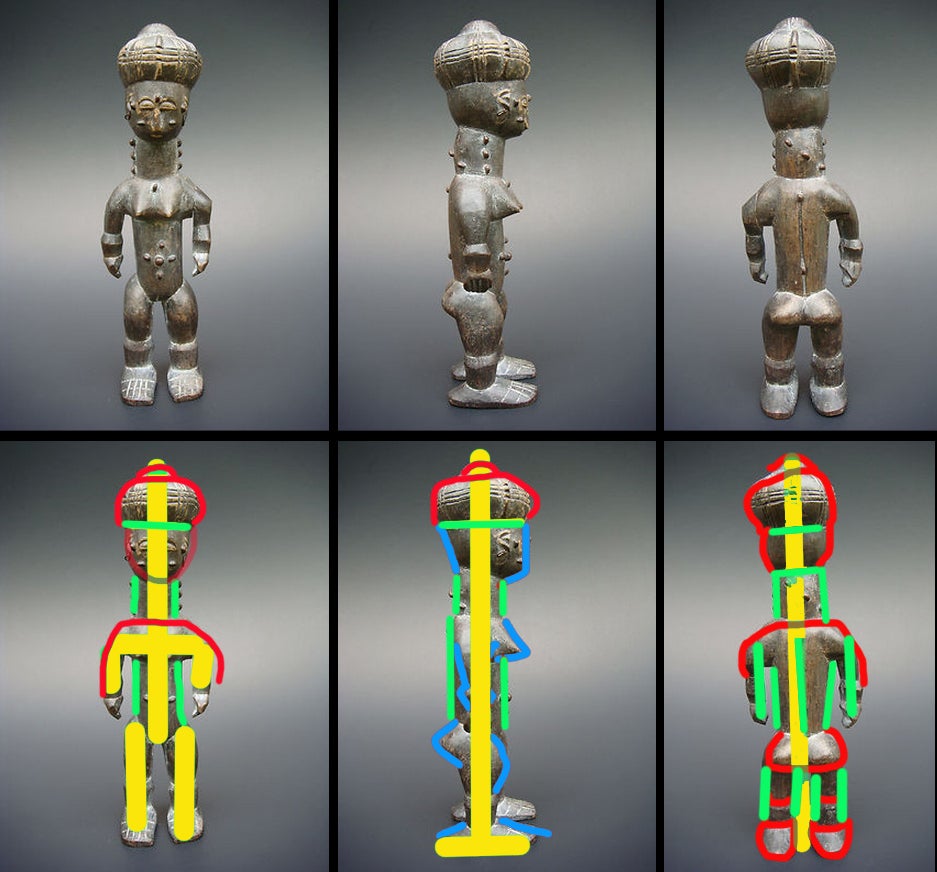
In three-dimensional work, we aren’t actually referring to the mark a theoretical point makes as it moves, but typically discussing the lines produced by the edges of forms, or invisible directional lines made by forms (a sculpted figure’s outstretched arm, for instance, might create a horizontal “line”) (Fig. 103).
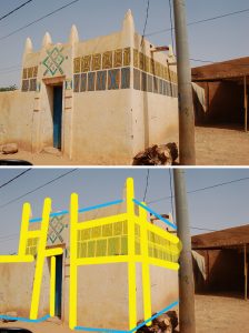

When considering buildings and some sculpture, lines can be created not only by the edges of the structure, but by the decoration of its surface. In Fig. 104, the Hausa building is a basic rectangle with some vertical extensions along the roofline. The area around the door is built up, however, creating two more verticals, and the individual rectangles that decorate the upper surface of the house are arranged in a thick horizontal band. That “line” is parallel to the horizontal edges of the building’s roof and foundation, as well as the top of the door frame. The reinforced verticals compete with the horizontals–does one actually dominate, or do they balance each other out? Often the answer is clearer than it is in this example.
Form
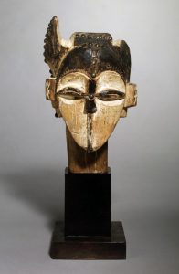
Form is the three-dimensional equivalent of the 2-D term “shape.” Some African sculptures are based on geometric solids (Fig. 105), while others employ organic shapes, whether they are sculpture or architecture. Certain forms are common in human representations and specific terms describe them. One is the “heart-shaped face” (Fig. 106). This convention, often seen in Central African traditional art, confines the facial features to a sunken area, the browline forming a heart-like double arch, with the mouth often positioned where the point of a heart might be.
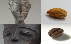
Sometimes individual facial features are stylized in ways that resemble other objects, and their names are used as descriptors, such as the “coffee-bean eye” or “almond eye” (Fig. 107).
Light and Shadow
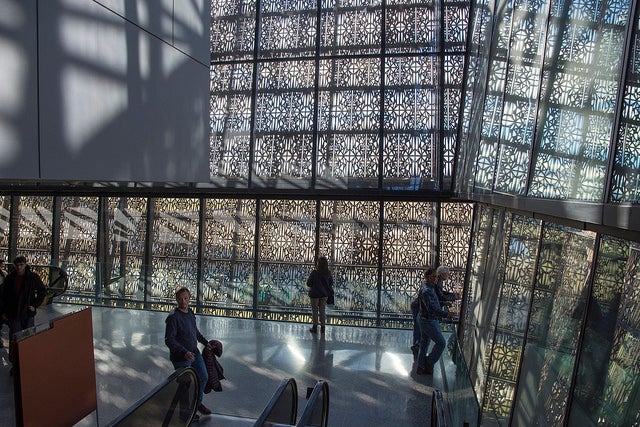
Light and shadow are not consistently discussed when considering 3-D objects and structures, since they are often out of the artist’s control.
Sculptors and architects do, however, sometimes consciously incorporate light and shadow as a design feature. This can be done through the use of materials that actually illuminate, such as neon, LED lights or glow sticks (see video below), or may result from planned interaction with natural sunlight’s refractions or broken shadows (Fig. 108).
Texture
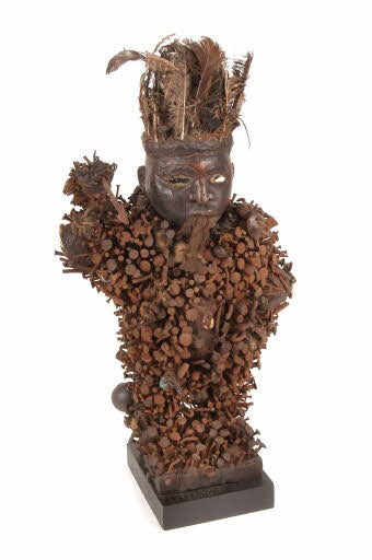
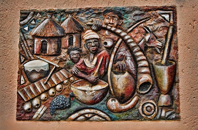
Three-dimensional texture always refers to actual rather than illusionistic texture. It is produced both by the material and the artist’s working of that material. Some artists create works with all-over textures, while others contrast smooth expanses with areas of submerged or raised surfaces.
In African traditional art, texture also frequently result from the use of multiple mediums in one piece. A wooden sculpture, for example, might have a feathered headdress, be dressed in actual cloth, and wear a beaded necklace with metal earrings. These all provide varied tactile sensations for those allowed to touch the artworks. Even without actual touch, viewers are experienced in the sensations produced by those materials, and can conceptualize what the surfaces feel like (Fig. 109).
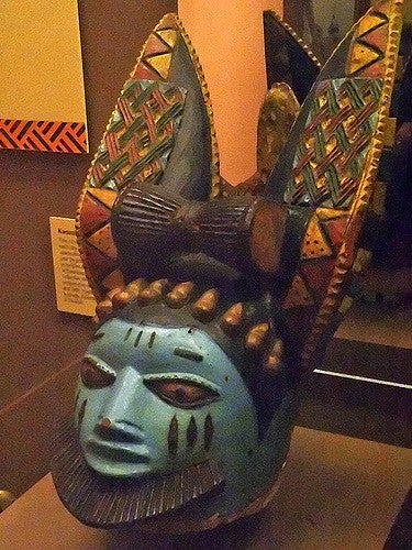
Color
Color can be painted onto a surface or the material used may have a color. Like two-dimensional usage of color, it can mimic observed colors in the real world or be simply the choice of the artist (Fig. 110). Its use can be symbolic or selected for its visual effect alone. Concepts relating to primary, secondary, tertiary, and complementary colors are identical to those of two-dimensional work, as are the definitions of tints and shades.
Mass
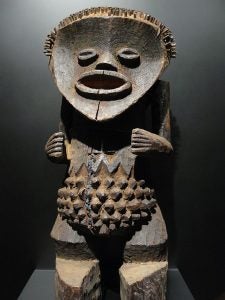
In three-dimensional art, mass refers to the apparent “weight” of the object, not to its size. A solid block of stone, for example, is equally massive whether 3″ square or 3′ square. If an artist wanted to lighten the mass, he or she would remove segments of the material so that parts of the original block are gone; these could be on the surface or could cut right through the block. How massive is a work? It’s often a term used comparatively, in order to state that Work A is more massive than Work B. Envision yourself as an employee of a packing company trying to crate an artwork in the smallest possible box. Any remaining space must be filled with small styrofoam particles. A truly massive work would fill the box without room for any particles. The more imaginary particles the packer needs, the less massive the work is (Fig. 111).
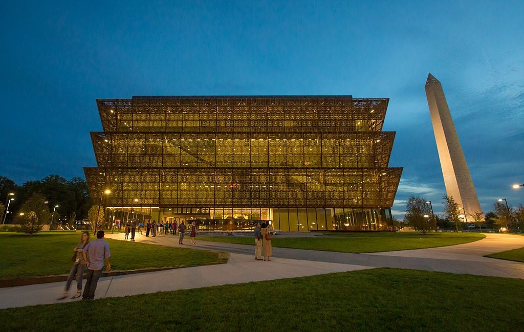
In architecture, a building’s mass can be lightened not only by changing its shape, but by making it transparent via a glass/plexiglass external surface. This kind of transparency has a visual effect similar to that of carving away the surface, although the surface remains solid. It is particularly apparent when illuminated from inside at night, which maximizes the transparent effect (Fig. 112).

