Chapter 2: Analyzing and Discussing African Art
Chapter 2.4 Stylistic Analysis
Stylistic analysis on its own requires the viewer to analyze the image or object by considering the elements and principles of design plus, in the case of traditional African art, the “rules” concerning standard traits. It requires no further contextual knowledge, yet the “rules” can sometimes suggest aspects of cultural interpretation.
While a stylistic analysis might involve considering every particular, usually time limits require the observer to select the chief visual factors present in an artwork. It’s usually done by running through a mental checklist and considering whether a particular trait is noteworthy in a given example. Let’s consider a contemporary two-dimensional work as well as a traditional three-dimensional work.

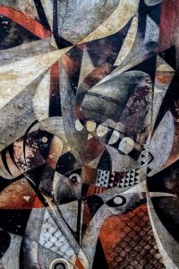
An untitled painting from Burkina Faso by S. Anoy. Andre (Fig. 139, which can be seen in greater detail by clicking on the image) is an abstract work that is nearly non-objective–that is, it is almost an aggregate of forms that cannot be identified as having any reference to the natural world. A careful examination, however, reveals a bird’s neck and beak at the lower right, and additional suggestions of fish or reptiles. The focal point is the central horizontal band of the painting, where smaller shapes and pattern details are concentrated. The color palette is limited to greys, white, and a rusty, low-saturation red, with the greys and creamy whites distributed throughout the work, and the reds more limited in size and number. Curving lines and curving triangular shapes dominate, with several prominent, eye-like circles or ovals concentrated in the painting’s lower half. Viewed when magnified, the canvas’s most noteworthy feature is its texture. The paint is applied thickly as an impasto, a paste-like state that creates an actual texture, and some granular, raised materials appear to have been added to the paint. Some areas that seemed to have been solid medium or charcoal greys are revealed instead to be segments of fine black and white parallel lines.
Visual analyses of three-dimensional works are not fully possible without seeing them in the round in person, or via multiple photographs. Even without these advantages, some information can be gleaned from single photos, though vital aspects may be missed.

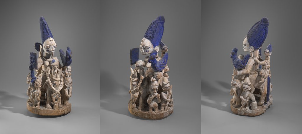
The figural group in Fig. 140 is compact, its focal point the equestrian female at its core. Attention is drawn to her in various ways: she is by far the largest figure in the composition, hieratic scale clarifying her superior position vis-a-vis her entourage, whose presence adds to her status. Her unnatural size in comparison to her steed also emphasizes her social status through hieratic scale. The chalk-white color that unifies all the figures and the horse is broken only by a bright blue. Although this color is used in small portions throughout the sculpture (the hair of the figure at the back, the horse’s tail, half the coiffure of the figure sitting in front of her, and the lining of equine and human eyes), its largest, most eye-catching use can be seen in her conical hairstyle, the rooster in her left hand and the rectangular fan in her right. Her blue-lined eyes and ethnic marks define her features and reinforce the blue expanses. Though fairly naturalistic, the frontal figures all have exaggeratedly large, bulging eyes, broad noses, and mouths treated like curving rectangles, not meeting at the corner; the shape of their ears is highly conventionalized. The figures standing on the base have a head-to-body proportion of 1:3, while that at the back is about 1:5, because of its unusually long neck. Although the central figure’s body is somewhat hidden by her supporters, her head-to-body proportions are about 1:4. The smooth textures of the body are offset by contrasting fine line in the hair, horse bridle, hats, fowl, and fan.
The paragraph above ignores certain aspects of the work’s stylistic elements, principles of design, and rules. The sculpture’s figures display stillness, ephebism, and self-composure, and all share a common generic physiognomy. One could certainly discuss line other than as a way of instilling texture, the blue could be further characterized by adjectives such as “bright” or “highly-saturated”. Individual shapes could be defined as organic, with the whole piece approximating a conical shape. Mass could be mentioned, as could the work’s roughly radial symmetry. The sculpture’s rhythm is regular, and its scale is fairly small in comparison to a human being. Why weren’t all these features mentioned? They could be, but some aspects are more critical and noteworthy than others–these are not necessarily identical for each viewer.
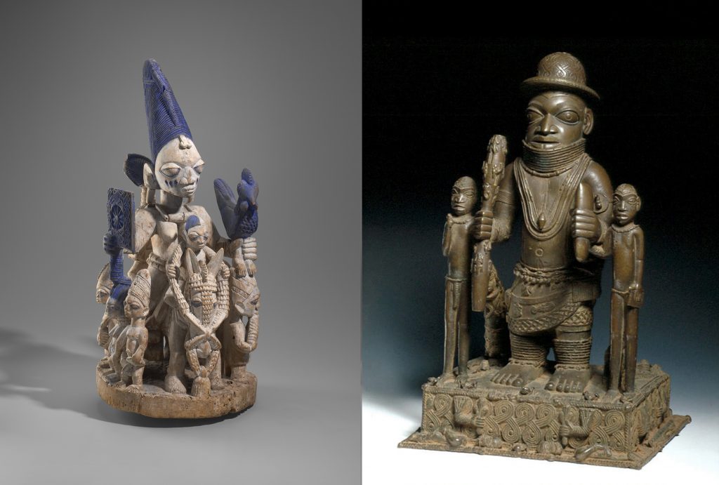
While a stylistic analysis can always be applied to a single artwork, comparisons allow for more relative assessments of a piece’s appearance. Considering style alone, let’s compare two works (Fig. 141).

These two figural groups (Fig. 141) both feature a central figure whose size relative to their supporters demonstrates their importance through hieratic scale. The work at left is slightly larger than the other [determined through the measurements, not the photos], but their scale is similar. The work at right is more formal in the one-view organization of its figures and its bilateral symmetry, broken only by the size of the objects in central figure’s hands and the single figure at back. The work at right is metal, attesting to its greater monetary value; this also lends it a common unifying color, while the bright blues at left draw attention because of their contrast to the otherwise all-over white. While neither work is completely naturalistic, sharing an emphasis on overlarge eyes, the face of the central figure at right has a more of a sense of bone structure, although this is not shared by its supporting figures. Both pieces include figures whose head-to-body proportions differ from one another. At left, the base figures have head-to-body proportions of 1:3, while the central figure’s head-to-body proportions are about 1:4. At right, the central figure is also about 1:4, while his elongated supporters are about 1:5 and lack his sturdiness and enlarged feet. In both cases, smooth areas are contrasted with textured details. Although both works build to a central apex, their differently-shaped bases mirror other emphases. The work at the left carries the circularity of the base into the placement of the figures, as well as employing its curves in the hairstyles, rounded hairline, and chicken’s body, while at right the prominently rectangular base is mirrored by the squared-off feet, balancing the curves of hat, necklaces, wrapper hem, and base motif. The compact nature of the work at left makes it more massive than that on the right.
Again, additional stylistic observations are possible, but the high points of comparison and contrast are covered. Neither piece is simply described separately, but instead compared point-by-point, with words like “both” and comparative adjectives being employed.

