29 Creating Alt Text for Informational Images
Heather Caprette
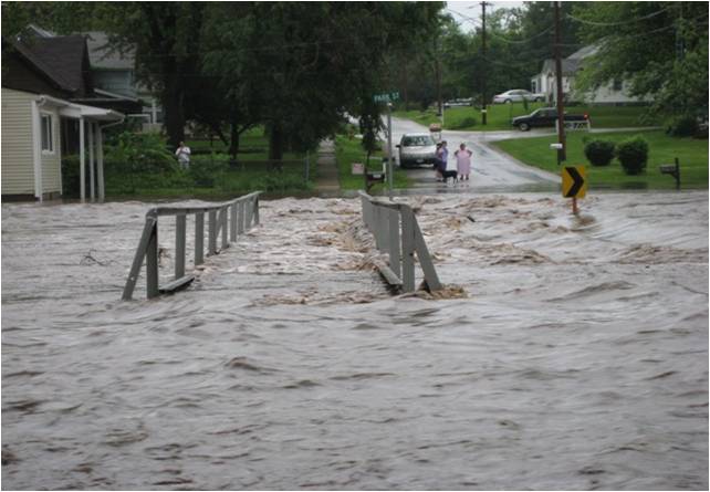
The example below gives information about flooding in an emergency preparedness course. Would you consider the photograph below the text to be informative or decorative? Does it convey important supplemental information that the surrounding text doesn’t?
Flooding:
The National Weather Service (NWS) issues flood advisories. A flash flood occurs within 6 hours of excessive rainfall and poses a threat to life and/or property. The following are advisories the NWS issues.
- Flash Flood Watch: A flash flood watch typically occurs 6 to 24 hours in advance of expected flooding.
- Flash Flood Warning: A flash flood warning is issued when flooding is occurring or imminent.
- Flood Warning: A flood warning is declared when general flooding is occurring, imminent, or likely.

Let’s say that I determine that the photograph does show important information I would like to get across to the audience. It shows an important impact of a flash flood. Here’s how I could go about adding the alternative text in Blackboard’s content editor.
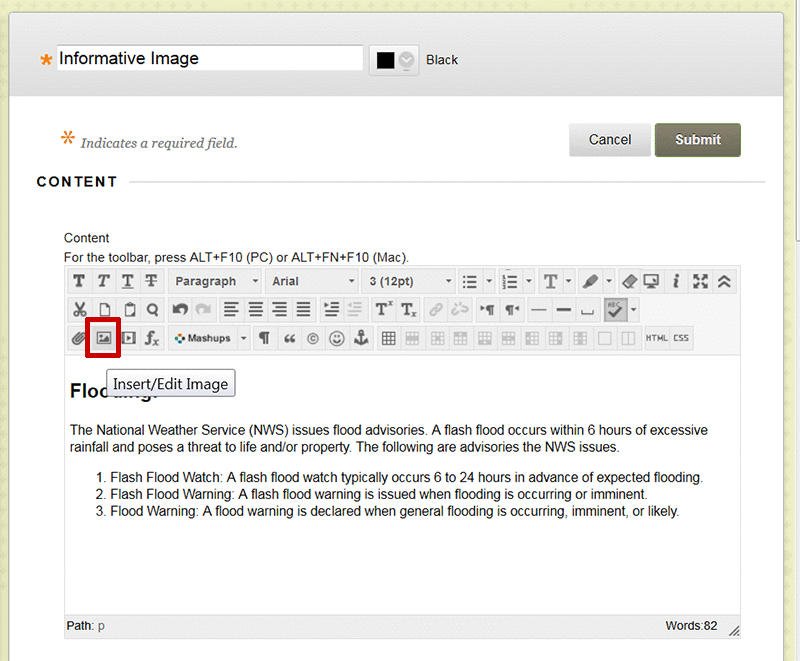
- With your cursor insertion at the point where you want to insert the image, click the Insert/Edit Image icon in the text editor. It is the second icon from the left in the third row, with a picture of a mountain. It’s outlined with a red box below.

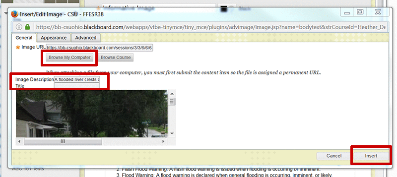
- Browse to the location on your computer or in the course, by clicking on the Browse My Computer button or Browse Course button.
- Select it by clicking on the name of the image file, and click Open.The Image URL will appear. Blackboard gives an image a unique URL once it has been uploaded to a course.
- Next, in the text entry box for Image Description, type the alternative text you have in mind for this image. Try to keep it short and succinct. If it goes over two sentences, you’ll need a long description instead. For this image, I chose to write, “A flooded river crests over the top of a bridge, extending onto the banks and roadway of a nearby community, where onlookers stand in frustration.” I chose to leave the title text box empty since I don’t have advisory information that I want to show as a screen tip for this image. The point to take away is that the Image Description serves as the alt text.

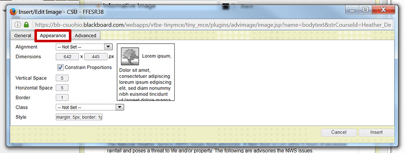
- The Appearance tab has some other options for styling the image that you might like to set before clicking the Insert button at the bottom of the Insert/Edit Image dialogue box. It has some older options for creating white space around an image so that it doesn’t butt up against surrounding content. These are called Vertical Space and Horizontal Space. I’ll set 5 for five pixels of white space both vertically, above and below the image, and horizontally, to the sides of the image. I’ll also set a 1 pixel wide border around it to help separate it from the background. As I set these styles, the HTML code is written in the Style text entry box. You can add styling here, or in the HTML Code View.

The code that Blackboard adds for the image looks like the following:
<img src=”https://bb–csuohio.blackboard.com/courses/1/Inclusive_Online_Design_1/content/_2019925_1/embedded/flooded_bridge_pg22.jpg” alt=”A flooded river crests over the top of a bridge, extending onto the banks and roadway of a nearby community, where onlookers stand in frustration.” style=”margin: 5px; border: 1px solid black;” height=”445″ width=”642″ />
Blackboard’s content editor uses the dimensions of the image to set the height and width in pixels. You can delete the height value (height=”445″) and change the width value (width=”642″) to a percentage. You would choose a percentage that you want the width of the image to take up within its containing element, which is the central white background content area in Blackboard. For the flooding image, I chose 40%. Percent is a relative unit that will allow the image to scale up and down with a resize of the browser window. This minimizes scrolling horizontally, which helps with accessibility and usability. So, in HTML Code View, the final code for the image would look like:
<img src=”https://bb-csuohio.blackboard.com/courses/1/Best_Practices_Accessible_Online_Design_Accessibility_Committee/content/_2171113_1/embedded/flooded_bridge_pg22.jpg” alt=”A flooded river crests over the top of a bridge, extending onto the banks and roadway of a nearby community, where onlookers stand in frustration.” style=”margin: 5px; border: 1px solid black;” width=”40%” />
Banner Example
In the case of a logo or banner for a department, you can simply use the text within the image, or the department or school name that it represents as the alternative text. For the School of Nursing banner, the alt text would be “School of Nursing.” The code would look like the following:
<img src=”https://bb-csuohio.blackboard.com/bbcswebdav/pid-2171113-dt-content-rid-11788111_1/xid-11788111_1″ alt=”School of Nursing” width=”90%” />


