42 WAVE Web Accessibility Evaluation Tool
Heather Caprette
There are a variety of free web accessibility checkers available on the web. They can give you an idea of how accessible a webpage is, if you are requiring students or users to go there. I’ll provide a list of free resources at the end of this lesson. We’ll focus on WAVE web accessibility evaluation tool here.
WAVE, hosted by webaim.org, is available as a website and as an extension for Chrome browser. The WAVE web accessibility evaluation tool website is located at http://wave.webaim.org. Once on this page, you can enter the url of a web page to check its accessibility. The same tool exists in a form that will check the accessibility of password protected or internal pages, as well as public web pages. For this, install the WAVE extension for Chrome. The WAVE Chrome extension will also allow you to evaluate pages that use JavaScript. JavaScript is stripped out of the page when displayed on the WAVE website evaluator. There is more information about WAVE Chrome Extension at http://wave.webaim.org/extension/. Webaim has a help page that explains how to use WAVE at http://wave.webaim.org/help.
WAVE checks for compliance with many WCAG 2.0 guidelines, but no automated tool can check for all issues with the guidelines.
Once the analysis is run, WAVE presents a report on the top left side of the screen as well as embeds icons and indicators within the web page. You don’t need extensive knowledge about web accessibility to benefit from the results. The RED icons indicate accessibility errors. If you get red icons, it is likely that someone with a disability will have difficulty accessing the content.
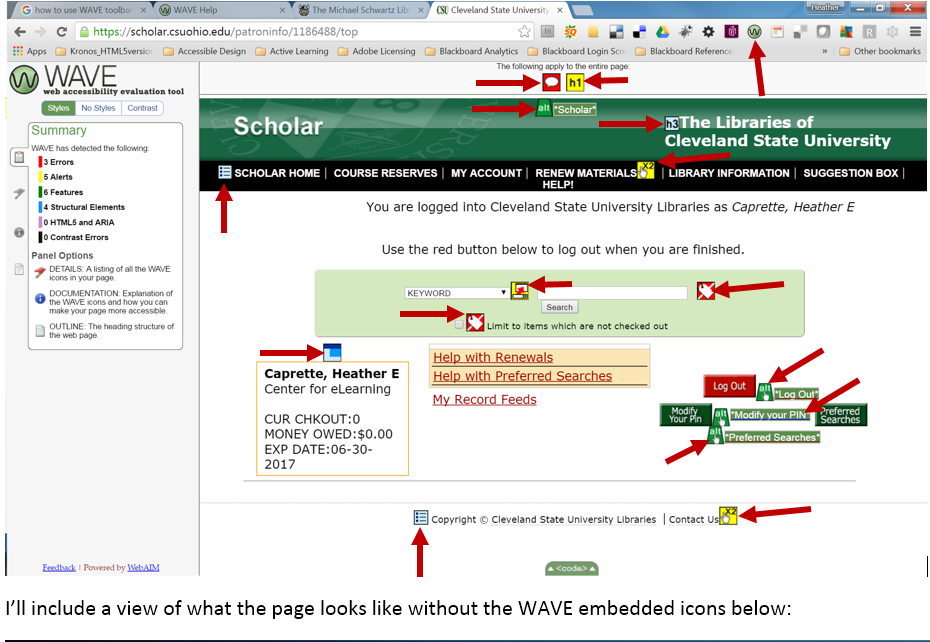
Below is a screen shot of a WAVE report for the internal landing page for a personal account within our library’s system. This is a very clean page with few errors and warnings. You can see the “W” icon within a circle at the top left of the browser window. After I logged into my account at our library, I clicked on the Wave “W” icon at the top to run the web accessibility report. I’ve added red arrows to point out embedded icons which WAVE added to the page. Red icons indicate problem areas. Yellow icons indicate warnings. Green icons indicate accessibility features (green icons) that may or may not be helpful to someone using a screen reader. The blue icons indicate structural elements that have been included that can potentially help people using a screen reader or other assistive technology, navigate your page more efficiently.
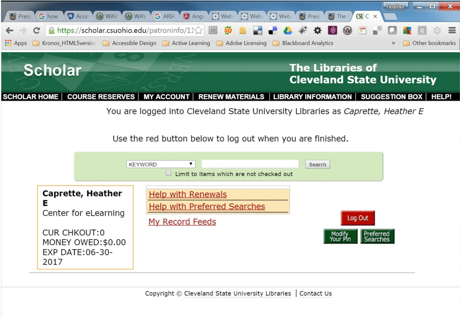
I’ll include a view of what the page looks like without the WAVE embedded icons below:
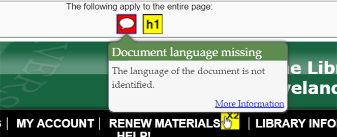
When you click on the icons embedded in the web page, you get more information about what each means. The top red icon with the white bubble, for example, says that the language for the page isn’t specified. Setting the language is important for screen readers to read in the correct language. I’ve personally heard JAWS switch from reading in English to reading in French once it ran into the word “prerequisites” in a syllabus. The author never intended for this to happen. If you are authoring an HTML page, you can set a language attribute on the HTML tag at the top of the document. The code would look like this for United States English:
<html lang=”en-us”>.
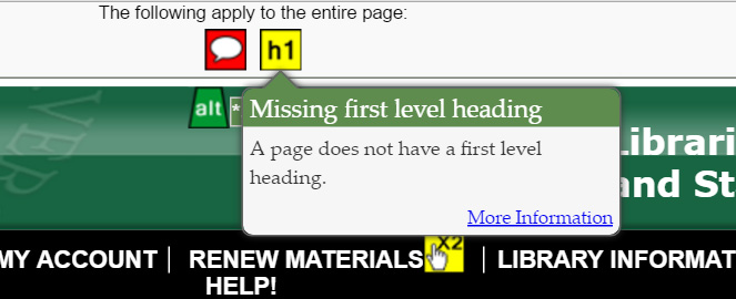
The yellow “h1” warning icon to the right of the red icon states that there is no heading level 1 for this page. It’s best to put a heading level 1 at the top of a web page to tell what the main topic of the page is. The visual headings on the page should be represented in the heading tag structure on the page, in the correct hierarchical order. There should be one h1 at the top of the page followed by heading level 2. Any subheadings would be represented by h3 through h6.
Form Labels As An Example of An Important Accessibility Guideline
Forms are vital to business and education. It’s impossible to get through college without having to fill out forms online. Even within courses students are asked to register with professional organizations, or register online with services that check for plagiarism, such as Turn-it-in. If you are directing your students or users to fill out a form, it’s important that each input item in the form be coded with an “id” attribute that directly corresponds with a “for” attribute of a form <label> element. WCAG 2.0 techniques for Using label elements to associate text labels with forms also tests for visibility of the label for conformance. With explicit labeling, this code looks like the following for a text entry box asking for a first name:
<label for=”
<input id=”firstname” name=”firstName” type=”text”>
On the web page this displays like the image below.
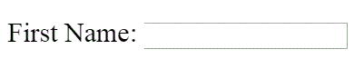
With explicit labeling, the user can click on the text “First Name” and the cursor will insert into the text entry box to the right of it, which helps people with mobility impairments who may have trouble clicking in small areas. Not only do these labels increase the area for a person with a mobility impairment to click on, in order to fill an input element such as a text entry box, they also help screen reader users know what they are supposed to be entering in a form input, such as their first name or last name. Fieldsets and legends are elements that should be used on pages with multiple forms to help the person filling out the forms distinguish between them. Fieldset tags group related form items and legends provide a title or short description of what the grouped form items are for, e.g. a home address. A good use of this would be when there is a set of inputs for a mailing address and another set of form inputs for a billing address.
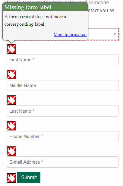
Simply putting the text “First Name:” next to the text entry box is not a reliable form of labeling. The same is true for forms that save space by placing the label inside the form input, such as shown below. Screen readers may read these, but there’s no explicit connection between the labels and their inputs. Also, putting a form label inside of a text entry box, is not good for users with cognitive issues that include short term memory or attention. The label often disappears as soon as the user clicks within the box. If the person forgets what was needed for the input, she or he will have to back track out of the form input to discover what it is. I know it is hard to imagine, for some of us, what this is like. Keep in mind that we have a legal obligation to make our programs accessible to them. Nielsen Norman Group has an article about the harmful impacts of placeholders in form fields for usability, accessibility and conversion. Below is a screen shot of WAVE flagging form fields with labels inside the text entry boxes.
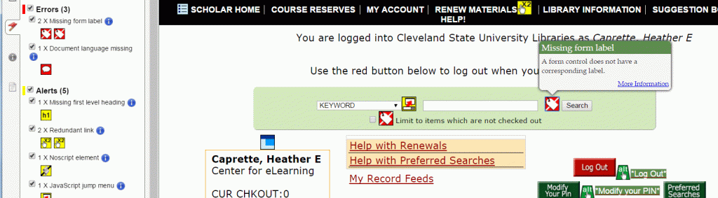
Leaving form labels as visible within the code is important for passing accessibility checks. In the WAVE analysis of the Scholar search form above, WAVE and other accessibility auditing applications yield an error for the form labels for the central search inputs. In a couple cases, this is not due to form labels not being present in the code, but because they aren’t visible. Their display is set to “none.” Some screen readers will ignore content with styling that sets the visibility to “hidden,” or the display to “none.”
Listen to the following demonstration of NVDA reading the central form fields on the CSU MyAccount page. Listen with your eyes closed and imagine never having seen the page, as I tab through the form elements in order.
Movie demonstration of NVDA reading non-displayed form labels and one check box with a missing label
The image below shows the red and white warning tags next to the form inputs that need visible form labels.
The code for the inputs above looks like the following:
<label for="searcharg" style="display:none;">Search Type</label>
<input id=“searcharg“ name=”searcharg” size=”30″ onchange=”return searchtoolSubmitAction()” maxlength=”75″ value=”” type=”text”>
A way to get around the issue of hiding a label visually, but making it available for screen reader users, is to use WAI ARIA. WAI ARIA is an extension of HTML. An aria-label attribute can be added to an input element to give it a label that is detected by assistive technology. Important to note here, is that there is no added benefit for people with mobility impairments, such as mouse users with tremors or spastic hand movements, needing a larger clickable area. The code for an aria-label would look like the following:
<input type=”text” name=”search” aria-label=”Search”>
<button type=”submit”> Search</button>
In another instance of a label error, the code lacks a form label. This is for the check box input next to the text, “Limit to items which are not checked out.” In this case, there is no label element above the input element. The code looks like the following:
<div>
<input name=”availlim” value=”1″ type=”checkbox”></input>
Limit to items which are not checked out
<br/><br/>
</div>
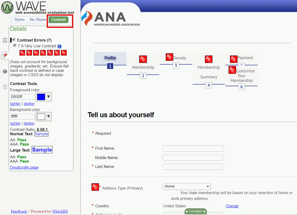
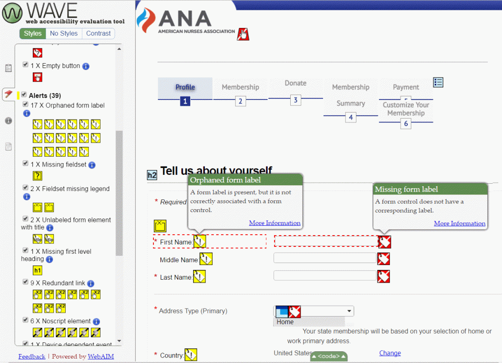
The following example shows problems with a form to join the American Nursing Association, an organization Nursing students are asked to join. The form lacks properly coded labels to associate form fields with their text descriptions. The labels are present, but the form inputs don’t have corresponding id attributes to associate them with their labels. The yellow tag warning icons are next to the labels that have no corresponding input, and the red tag error icons are next to the form fields that aren’t marked up to associate them with their labels. The ANA has a paper form that is meant to be printed and mailed in. It is an untagged PDF, with no form elements, and therefore not accessible to the blind and visually impaired. It’s best to look for sites that have contact phone numbers with people that can help register a user who can’t use their site. Alternatively, someone at CSU would need to help a blind or visually impaired person complete a form.
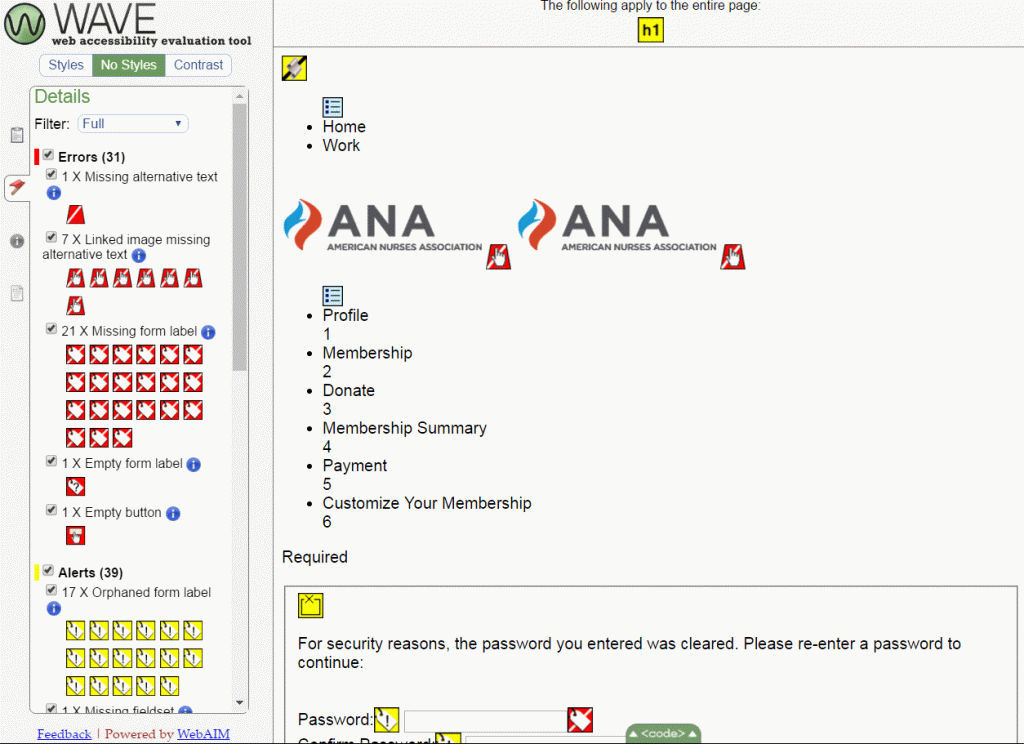
WAVE extension for Chrome also has a tab at the upper left side to turn off presentation Styles to see the structure of the page. This button is called No Styles. When you click it, you’ll see navigation as lists, hopefully headings to provide structure, as well as paragraphs of text. This structure is similar to what a screen reader sees and reads out. If the structure lacks lists for navigation, headings, or fieldsets with legends for multiple forms, this can be a warning sign that the page will be have to be read through from beginning to end by someone using a screen reader, and will be more time consuming to navigate. Below is a screen shot of what the form page above looks like with styles turned off.
WAVE also has a tab for checking color contrast, called Contrast, at the upper left. When you click on this, you’ll get warning icons for areas where the text doesn’t have a high enough contrast ratio with its background to pass WCAG 2.0 standards. The icons in red below, that have an ABC on them are areas with color contrast problems. There’s no eye dropper tool to sample colors, so the Paciello groups Colour Contrast Analyser would be a much stronger tool to use to find color and contrast issues, and find color combinations that will pass WCAG 2.0 level AA.