Best Practices
5 Decorative Images and Use of Color
Decorative images
If an image does not add meaning, i.e., if it’s included for decorative or design purposes only, or if the image is adequately described in the caption and/or surrounding text, it doesn’t need an alt tag. Including alternative text descriptions for decorative images “simply slows the process down with no benefit because the screen-reading software vocalizes the content of the [alternative text description], whether that alternative text adds value or not.”[1] However, this doesn’t mean that you should leave an alt tag blank.
When a screen reader detects an image with a blank alt tag, it will read out the image file location. If The Wong-Baker Faces pain scale didn’t have an alt tag, a screen reader would say, “Graphic: https://opentextbc.ca/accessibilitytoolkit/wp-content/uploads/sites/184/2017/06/2049201506_0f9b17182a_o.jpg.”
You can add the null alt attribute to an image tag within Pressbook’s Text view.
- Click the Text tab.
- Locate the <img> tag for a decorative image you have just placed.
- Add a space after the ‘src’ attribute and write alt=”’ with no space between the quotation marks. This should cause the screen reader to not announce that there is a graphic present and skip over it.
- An example of what this could look like is: <img src=”images/flourish.gif” alt=””>
Using color
Consider what your images would look like if they only displayed in black and white. Would any necessary context or content be lost if the color was “turned off?” Images should not rely on color alone to convey information; if your point requires color, you may need to edit or format the image so the concepts presented are not lost to those who are color blind or require high contrast between colors. Use of blue and red color palettes, as opposed to shades of green, are usually better for people who are color blind to tell the difference between the two colors in a data visualization.
Other techniques you can use to enhance the contrast and separation between images is to use variations on dashed or dotted lines on a line graph, black or white outlines around bars on bar charts. Please also download and use the free tool Color Contrast Analyser to check to see if you have enough contrast between colors. Color Contrast Analyser will also show you what colors look like to people with various color blindness, or deficiencies in detecting red, green, or blue light.
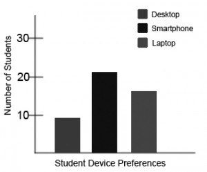
Example 1: Inaccessible Bar Chart
In Chart 1, colour is the only means by which information is conveyed. For students who are colour blind, have poor contrast vision, or are using a black-and-white print copy (see Chart 2), relevant information is lost.
 |
 |
.
Example 2: Accessible Bar Chart
Students who are color blind can distinguish between high-contrast shades. In Chart 3, contextual labels have been added to each bar at the bottom of the chart. Note that the chart will still require an alt tag.

- "Top 10 Tips for Making Your Website Accessible," UC Berkeley: Web Access, accessed March 27, 2018, https://webaccess.berkeley.edu/resources/tips/web-accessibility#accessible-alt. ↵
